First, look at where the print lives
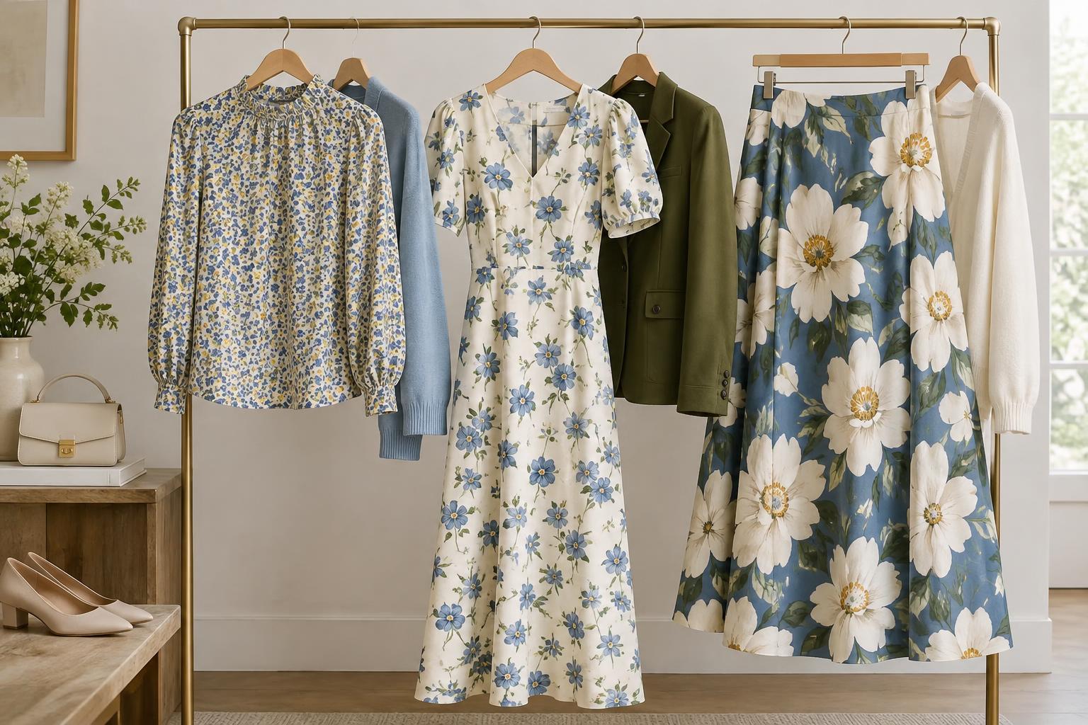
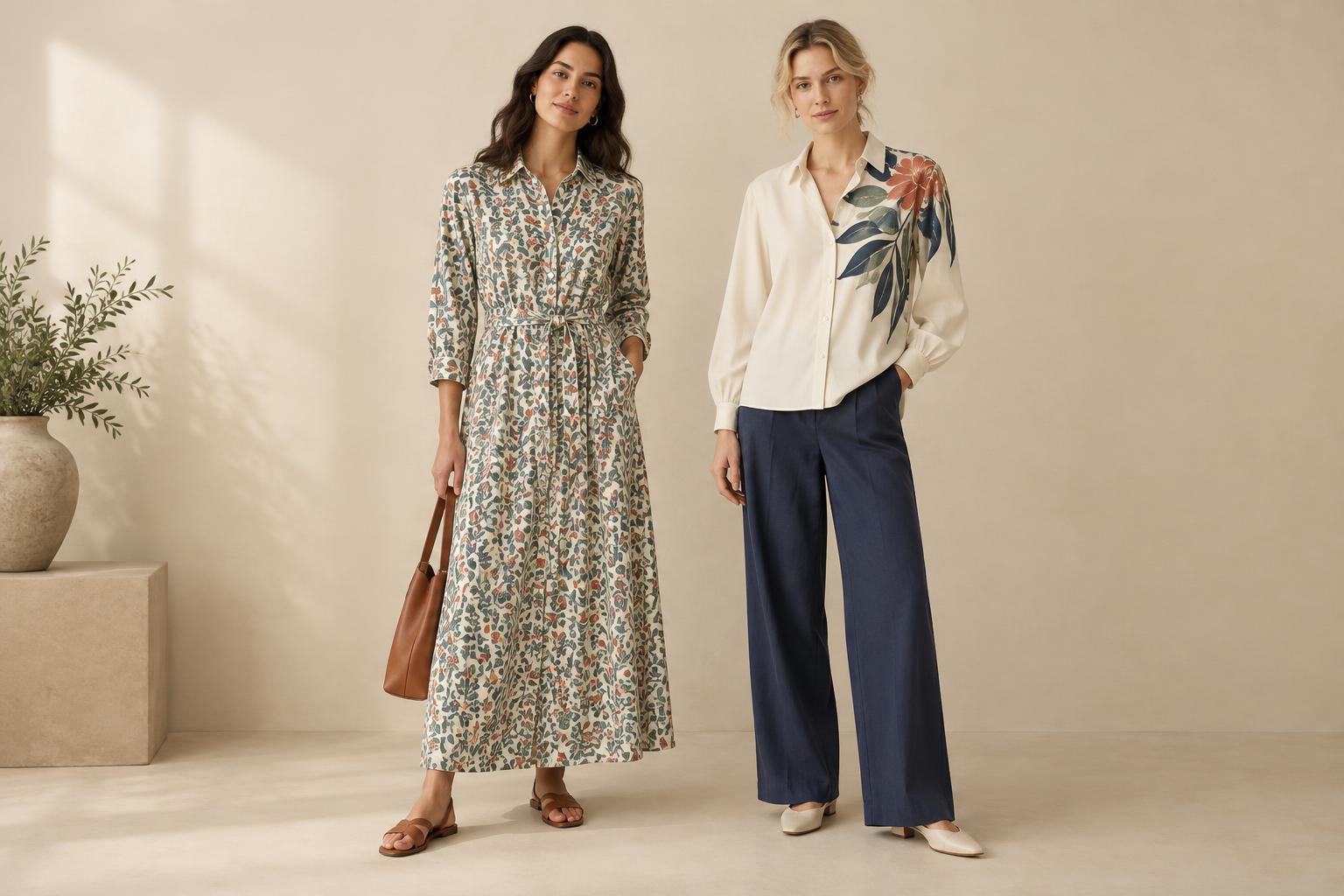
An all-over print repeats across most or all of a garment. Think of a shirt covered in small checks or a skirt with flowers from waistband to hem. A placement print sits in a particular area, such as a motif on the chest, a border near the hem, or an image running down one sleeve. Either can be bold or subtle. The distinction is not what the print depicts, but how much space it occupies and where your eye lands.
That difference can change the role a garment plays. An all-over print often becomes the visual texture of an entire piece, while a placement print can act more like an accent. Neither is automatically easier to wear. A small, low-contrast repeat may blend quietly into an outfit; a large graphic at the center of a plain top may become its strongest feature. Before choosing between them, consider both coverage and contrast.
How each print directs attention
Repeats encourage the eye to move around a garment rather than stop at one spot. Their effect depends on scale, spacing, and color. Tiny, closely spaced marks can read almost like a solid from a distance, while widely spaced, high-contrast shapes remain distinct. A continuous print can also make a dress or matching set feel cohesive, because the same visual idea carries across the whole look.
Placement prints create a more specific focal point. A small chest motif draws attention upward without dominating the outfit. A broad design across the back has a different effect: understated from the front, expressive when you turn around. A border at the cuff or hem highlights an edge, which can be useful when you want the shape of a sleeve or skirt to stand out. These are styling effects, not rules about which parts of the body should be emphasized.
Look at the garment while it is on, not only laid flat. A motif may sit differently once fabric drapes or stretches, and an all-over repeat may look busier where fabric gathers. If a print’s position matters to you, check it from the front and side and while sitting or moving.
Build the rest of the outfit around it
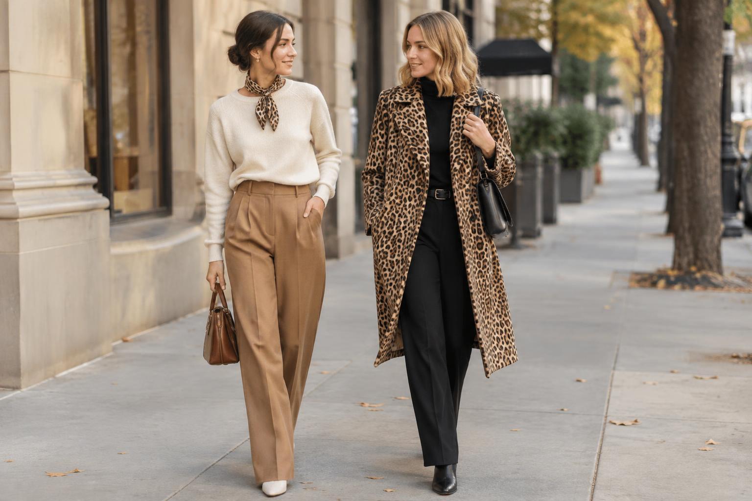
With an all-over printed piece, a reliable starting point is to repeat one of its colors elsewhere. For example, a blue-and-cream printed shirt can sit with cream trousers and blue shoes, or simply with jeans. Pulling out a quieter color keeps the print present without requiring every item to match. If the repeat is small and restrained, you can also treat it like texture and pair it with a larger-scale pattern.
A placement print gives you more unprinted fabric to work with. A tee with a single graphic can go under an open overshirt, provided the design remains visible enough to make sense. A printed hem can peek out beneath a shorter jacket. If layering hides the motif entirely or cuts through its most important detail, try wearing the piece on its own or choosing a different outer layer.
Accessories can reinforce either approach without copying the print exactly. A bag in one of the garment’s colors connects the look; a plain belt or simple earrings give the eye somewhere to rest. When mixing prints, vary their scale or contrast so they do not compete in precisely the same way. You do not need a perfect color match: a shared neutral or a similar color family is often enough.
Choose the print that suits how you wear the piece
Consider the garment’s everyday job. An all-over print can be useful on a piece you want to wear as the main event, such as a dress that needs little added styling. A placement print may suit a familiar basic when you want a single expressive detail. If you often wear jackets, notice whether a graphic disappears under them. If you tuck in tops, check whether a low placement print gets folded away.
Construction deserves a glance, too. On an all-over print, check how the pattern looks at seams, pockets, and closures; an interrupted repeat may be perfectly fine, but you may prefer one that feels more continuous. On a placement print, check that the design sits where you expect on your size and does not become distorted by a seam or stretch. For either type, follow the garment’s care label, particularly if the design is printed on the surface rather than woven into the fabric.
The most useful test is simple: imagine three outfits you would actually wear with the piece. If the all-over print works with your usual shoes and layers, it may be more versatile than it first appears. If a placement print gives an otherwise plain outfit the right amount of character, it has done its job. Let the print’s position help you choose—not limit how you express yourself.