Start with the size of the flowers
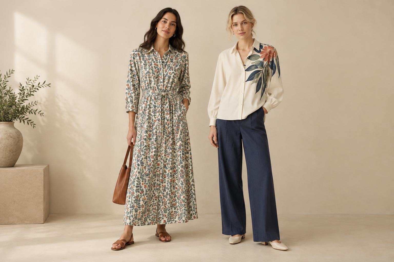
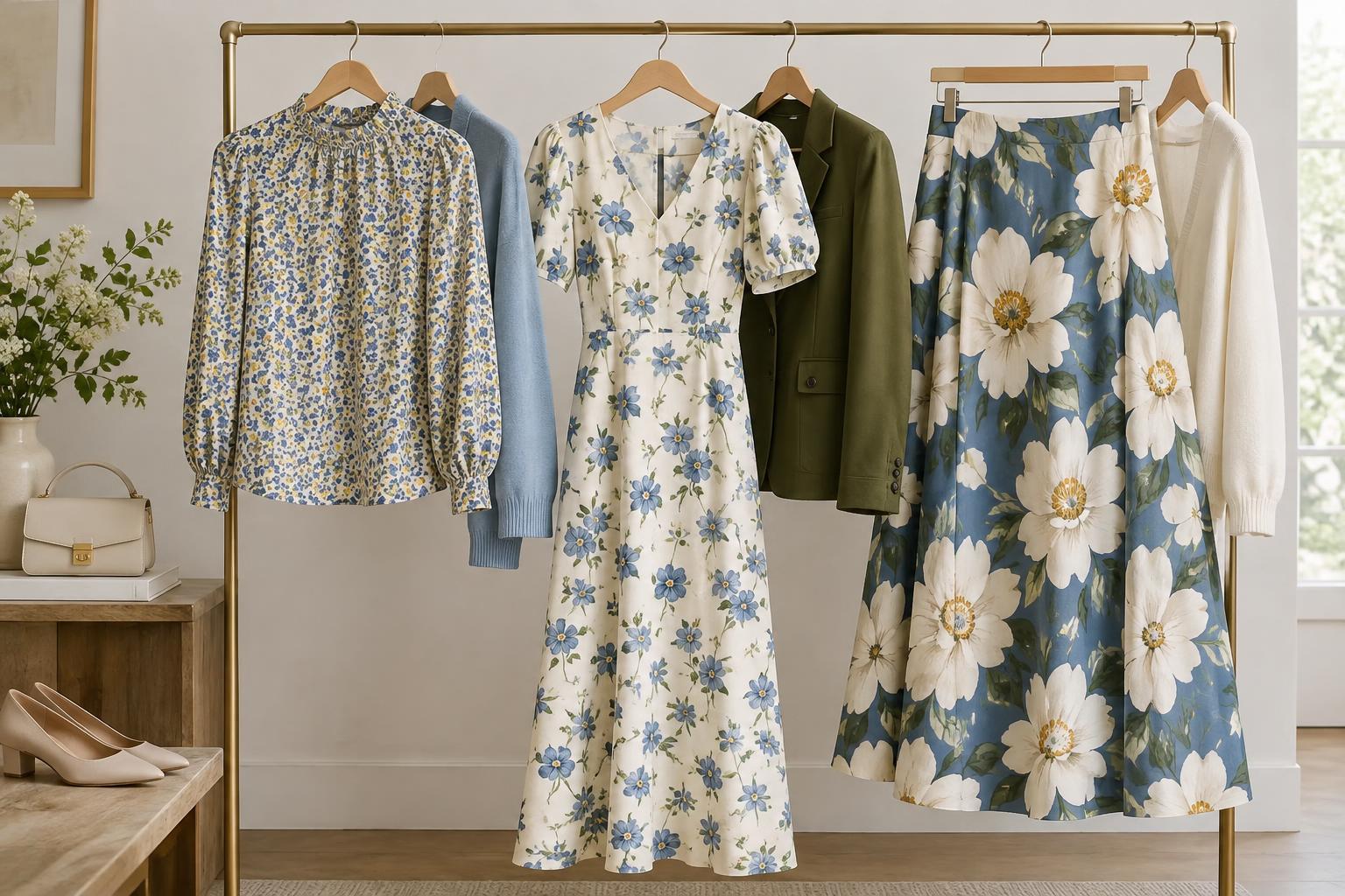
When comparing floral prints, look first at the size of the motifs relative to the garment. A tiny flower on a shirt may read almost like texture from a few steps away, while a large bloom can become the focal point of an outfit. Neither is inherently easier to wear; the useful question is how much attention you want the print to draw.
Small-scale florals often work well when you want a patterned piece to blend into everyday outfits. Try a fine floral blouse under a solid cardigan, or a small-print skirt with a simple T-shirt. Larger florals give you more visible shapes and can make a dress, jacket or pair of trousers feel complete without many accessories. If you like a large print but want a quieter look, choose colors close to the background rather than a sharp contrast.
Notice how much space sits between motifs
Spacing changes a floral print as much as flower size does. Closely packed blooms create a continuous field of color and pattern. Wide gaps leave more of the background visible, so each flower stands out as a separate shape. Two fabrics with similarly sized flowers can therefore feel very different.
Dense prints can be useful if you prefer a pattern that feels consistent across a garment. A widely spaced print may feel airier, but it can also draw the eye to individual blooms. Before choosing one, look at the whole piece rather than a small fabric swatch. On a skirt or shirt, check whether you enjoy where the larger motifs appear at the hem, across a pocket or near the neckline. Printed items vary in placement, so seeing the full garment is more helpful than judging the pattern alone.
Consider contrast and background color together
Size and spacing do not act alone. Small flowers in bright colors against a dark background may look more prominent than large flowers in soft, similar tones. Likewise, generous spacing makes the background an important part of the design. If most of the fabric you see is cream, navy or green, think about that color as you would a solid piece in your wardrobe.
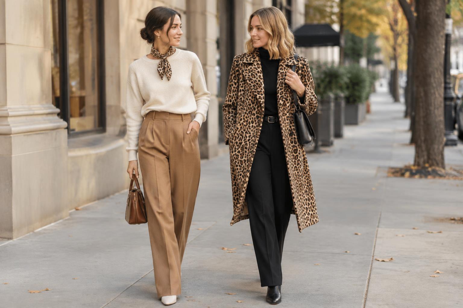
For an easy pairing, pick one color from the print and repeat it in a plain item. A floral shirt with a blue background might sit comfortably with blue jeans; a skirt with rust-colored details could work with a rust knit. You do not need an exact match. If matching feels too deliberate, choose a neutral already present in your wardrobe and let the floral provide the variation.
Match the print to the role of the garment
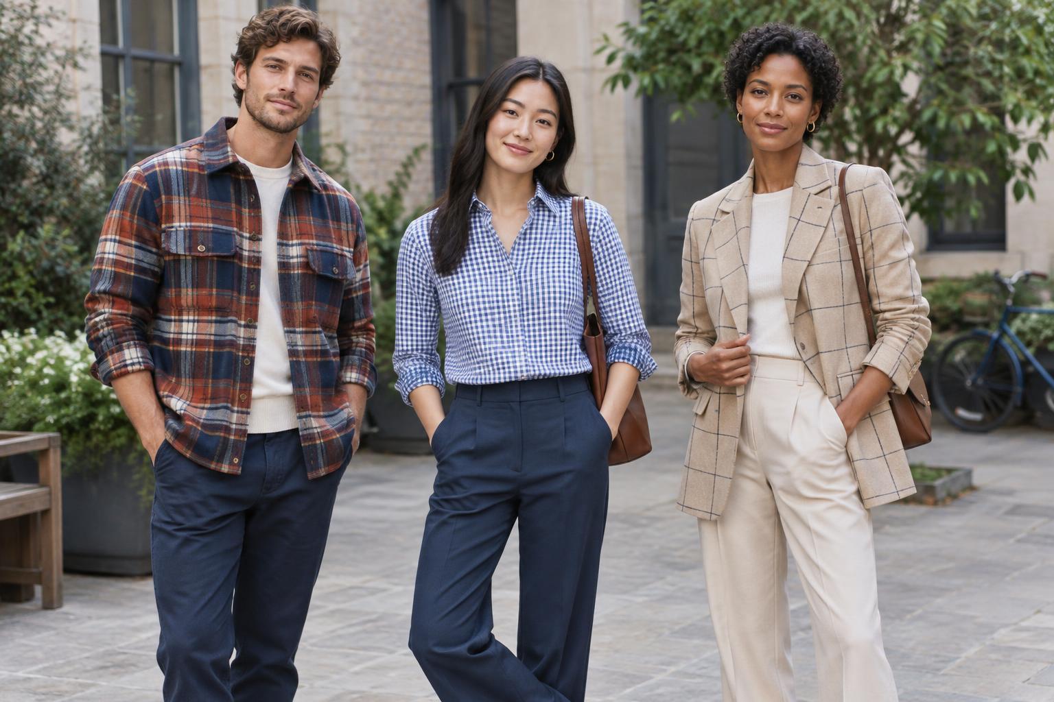
Think about whether the floral piece will be a quiet layer or the main event. A close, small-scale print can slip beneath a blazer or overshirt without competing strongly with it. A large, widely spaced print is more likely to remain noticeable even when only part of the garment is visible. That can be especially appealing on a scarf, an open shirt or a dress worn with a plain jacket.
The amount of fabric matters, too. A bold print on a small accessory may feel less dominant than the same print on a full-length dress. If you are unsure about a motif, try it first on a scarf, bag or short-sleeved top. If you love a particular print on a larger piece, there is no need to scale it down simply because it makes a statement.
Use a quick try-on test
When shopping or reviewing your closet, compare a floral piece from both nearby and a few steps away. Up close, ask whether you like the flower shapes and colors. From farther back, notice whether the print reads as texture, a field of color or a set of distinct blooms. Then put it beside two or three items you actually wear, rather than building an outfit around something you would need to buy.
Finally, check the print in motion. A draped scarf, gathered skirt or loose shirt changes shape as you wear it, which can make motifs overlap or spread apart. Choose the version you enjoy on your body and with your usual layers. Size and spacing are tools for understanding why a floral appeals to you, not rules about which prints you are allowed to wear.