Why the same color looks different on different fabrics
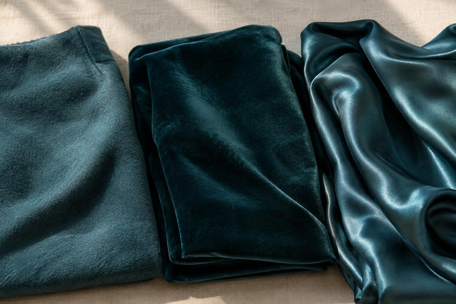
A color name tells only part of the story. Two navy garments can look noticeably different even if their dyes are similar. A smooth, shiny surface reflects light in concentrated highlights, while a matte surface scatters it more evenly. Texture adds tiny areas of light and shadow. Together, these effects influence whether a color appears bright, muted, deep or changeable.
This is why a fabric swatch is often more useful than a color label when planning an outfit. A crisp cotton shirt and a satin blouse may both be called ivory, yet the satin can catch warm highlights while the cotton looks quieter. Neither is the “true” version of the color; they simply present it differently.
What matte and textured fabrics do to color
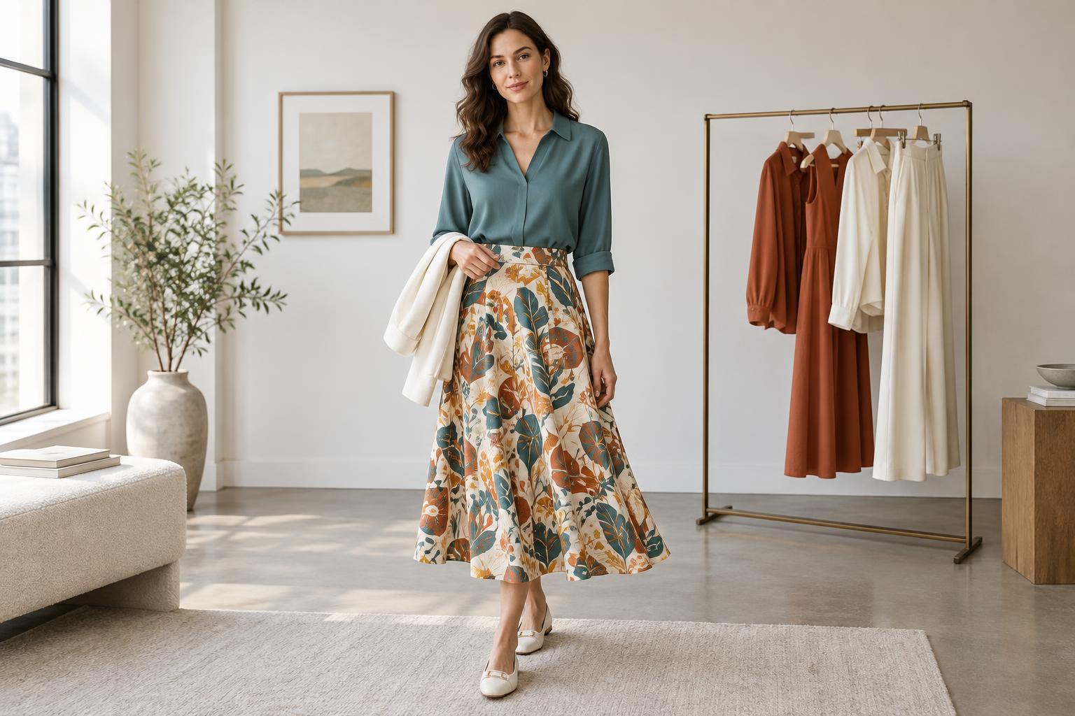
Matte fabrics tend to make color look steady and understated. Think of a cotton tee, a linen overshirt or a wool sweater: without prominent highlights, the overall shade is usually what you notice first. That quality makes matte pieces useful as the visual foundation of an outfit, especially when you want a bold color to feel easy to wear.
Texture introduces variation within that foundation. A chunky knit creates small shadows between stitches, which can give even a pale color more depth. Brushed or napped fabrics may look softer and less sharply defined. Linen’s irregular surface can make a solid shade feel relaxed rather than flat. If an outfit of similar colors feels lifeless, adding a ribbed top, woven belt or textured jacket may create contrast without adding another hue.
How sheen adds brightness and movement
Shiny fabrics reflect light more visibly, so their color may seem to shift as you move. Satin, polished leather and some smooth synthetic fabrics can show bright highlights alongside darker folds. This contrast often makes a simple garment more noticeable. A satin skirt in a restrained color, for example, can still act as the focal point of an outfit.
Sheen can also affect how well two pieces appear to match. A glossy black shoe may look sharper next to matte black trousers, while a shiny blouse may seem brighter than a matte jacket in a similar shade. These differences are not mistakes. Treat sheen as a design choice: repeat a little shine in an accessory for a connected look, or let one glossy piece stand out against quieter materials.
Pairing colors by surface, not just shade
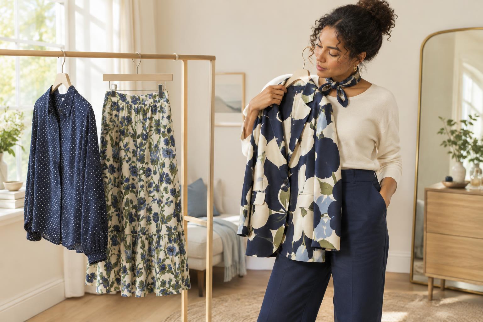
When combining pieces, ask what each surface contributes. For a low-key outfit, try a matte base with one contrasting texture: a fine-knit top with denim and a smooth leather bag, for instance. The colors can remain close while the materials provide interest. If you prefer stronger contrast, put a reflective piece beside something soft, such as a satin shirt under a textured cardigan.
Matching separates can be trickier than deliberately mixing them. Two items labeled the same color may look mismatched because one catches much more light. Instead of forcing an exact match, make the difference look intentional by adding a clear contrast in texture or choosing shades that are visibly distinct. A dark green knit with a lighter green skirt, for example, does not depend on the surfaces reading identically.
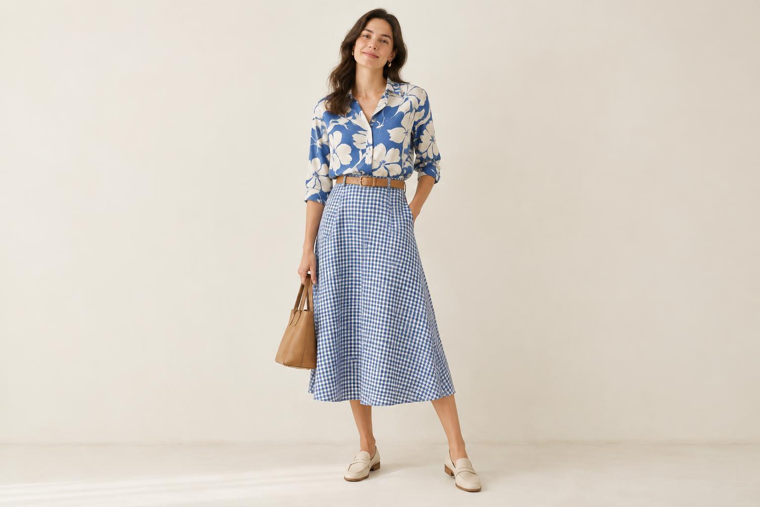
Patterns change with texture too. A fine print may look crisp on a smooth fabric but less precise on a heavily textured one. If you are pairing prints, look at them from a few steps away: check whether the pattern remains clear and whether the fabric’s highlights compete with it.
Check color in the light where you will wear it
Light can emphasize or soften every surface effect. Direct light brings out shine and the shadows in raised textures; diffuse light often makes those differences less dramatic. Indoor lighting can change the apparent warmth of a color as well. Before deciding that two garments clash, view them together in more than one kind of light if you can, and move them slightly to see how highlights change.
For online shopping or wardrobe planning, leave room for variation between a photographed color and the garment in hand. Product images cannot show every lighting condition or every fold of a fabric. Checking the material description and looking at how a garment drapes may help you anticipate its surface. Ultimately, texture and sheen are tools: once you notice them, you can use familiar colors in fresh ways without needing an entirely new palette.