Start by reading the print
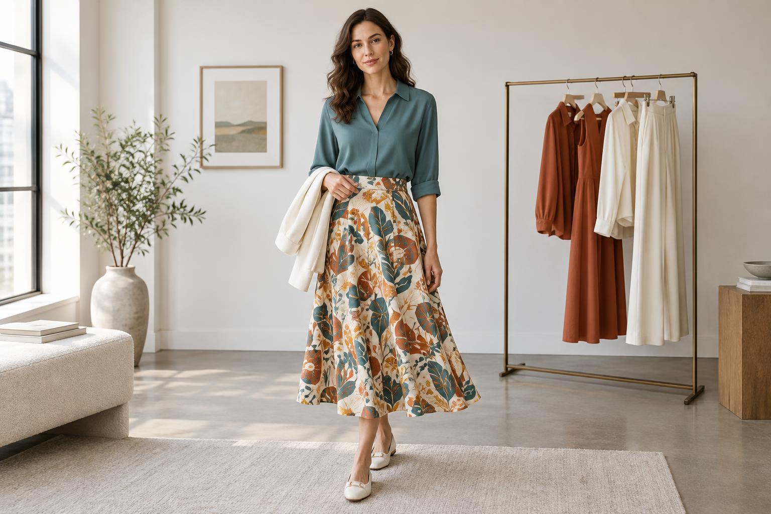
A multicolored piece can seem difficult to style because several colors compete for your attention. Before choosing a solid to wear with it, look at the print from a short distance. Notice its background color, the color that covers the most space, and any smaller accent colors. You do not need to match every shade. Picking one color to respond to gives the outfit a clear direction.
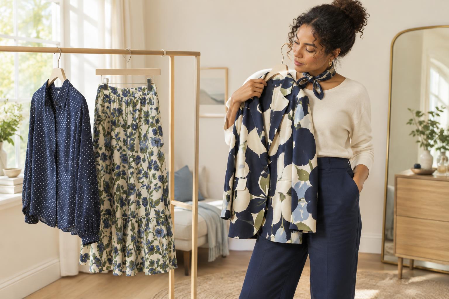
The background is often an easy starting point. If a floral skirt has a deep navy ground with pink, green and cream flowers, a navy top can create a continuous base that lets the flowers stand out. If you want a brighter outfit, choose one of the flower colors instead. The same print can support both combinations; the difference is how much attention you want the solid piece to draw.
Choose a color relationship, not a perfect match
Repeating a color from the print is a reliable way to connect two pieces, but an exact match is rarely necessary. A soft blue shirt can work with a print that contains a slightly darker blue. Compare the pieces together in natural light if you can, paying attention to whether their overall warmth and intensity feel comfortable side by side. When two near-matches seem to clash, move further apart: try a much lighter or darker version of the color.
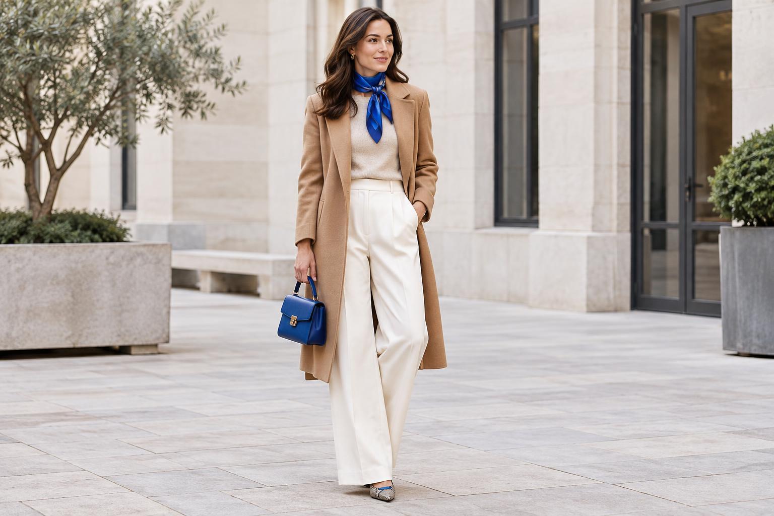
For a quieter pairing, choose a neutral that already appears in the pattern, such as cream, charcoal, brown or black. A neutral can also work when it does not appear in the print, especially if it suits the print’s overall mood. An off-white knit might soften a vivid print, while a dark trouser can anchor one. Think of neutrals as options rather than automatic rules; a warm beige, for example, may look less connected to a crisp black-and-white print than a cool gray.
Let intensity and contrast set the mood
The amount of contrast between your solid and your print changes the feel of an outfit. Pairing a pale solid with a dark print makes the break between pieces obvious. Choosing a solid close to the print’s background color creates a calmer, more continuous look. Neither approach is better. If you are unsure, hold the items next to each other and decide where you want the eye to land: on the print alone or on the combination.
Color intensity matters too. A print with muted, dusty colors often sits comfortably beside a similarly subdued solid. A bright solid pulled from one small detail can turn that detail into a focal point. If the result feels louder than you intended, try using the bright color in a smaller item, such as a bag or socks, and wear a quieter solid for the main garment. This lets you enjoy the color without making it cover half the outfit.
Balance the amount of print and solid
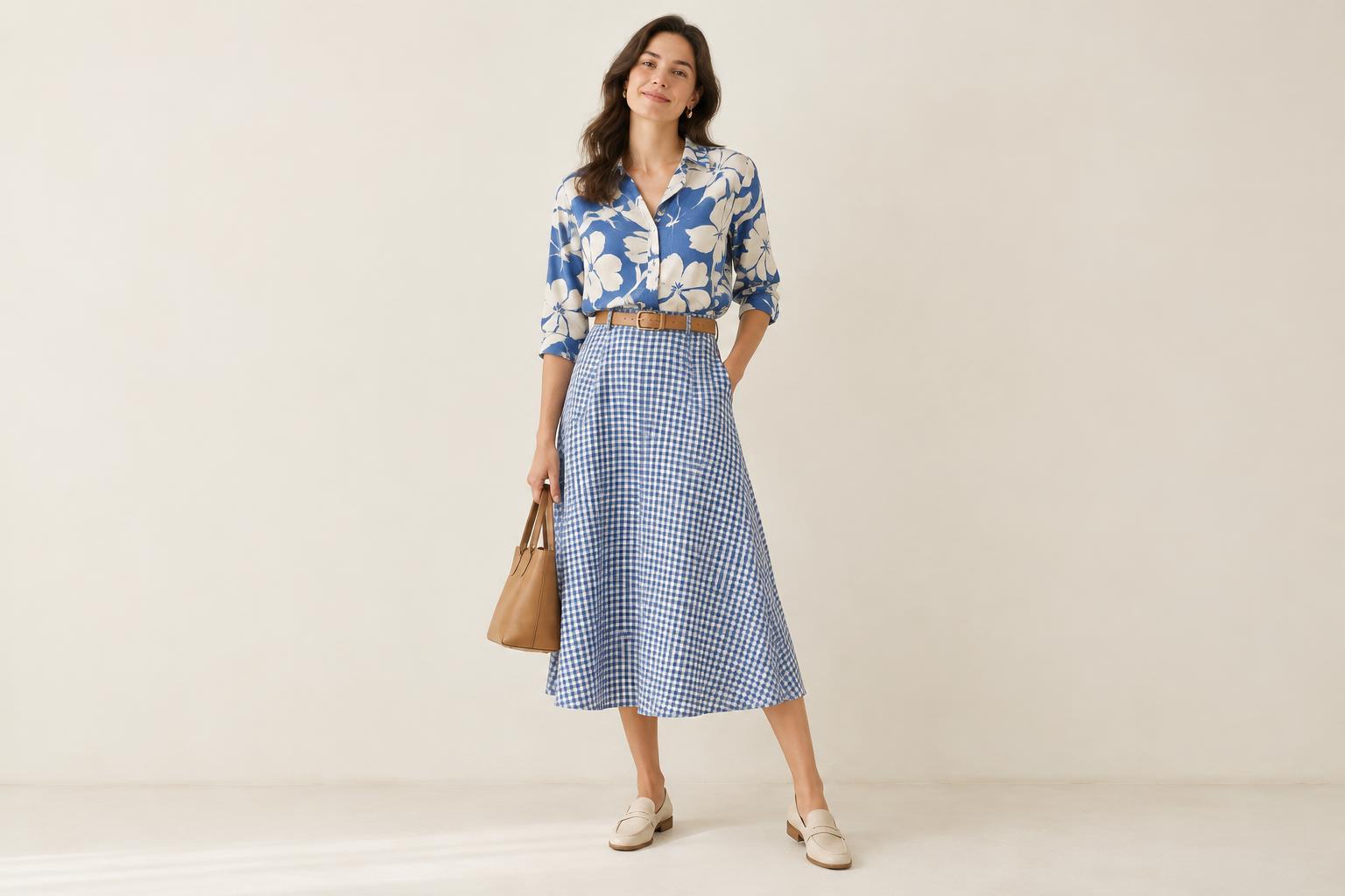
Consider how much space each item occupies. With wide-leg printed trousers, a simple solid top gives the pattern room to be the main feature. A small printed scarf, by contrast, can sit easily alongside a large area of solid color. You can also repeat one of the scarf’s minor colors in your top or jacket to make the small accessory feel intentional.
Shape helps as much as color. When the print is intricate, an uncomplicated silhouette can make the outfit easier to read: try a plain tee with a patterned skirt or straight trousers with a printed blouse. Texture adds interest without adding another pattern. A smooth cotton shirt, soft knit or denim layer may each change the feel of the same printed piece while keeping the color plan simple.
Build combinations you can wear again
If you are shopping for a solid to accompany a print you own, check what is already in your wardrobe first. Lay the printed item beside two or three possible partners, including one neutral and one color drawn from the pattern. Try the combinations on rather than judging them only on a hanger; the visible amount of each color may change once the pieces are worn. Shoes and outerwear can also affect whether the pairing feels complete.
For an easy starting formula, wear a multicolored print with a solid that repeats its background color, then add simple accessories. When you want variety, switch to a solid that picks up an accent color. These are starting points, not restrictions. The most useful pairing is one that makes the print feel like part of your everyday wardrobe and still feels like you.