Start with what you want the print to do
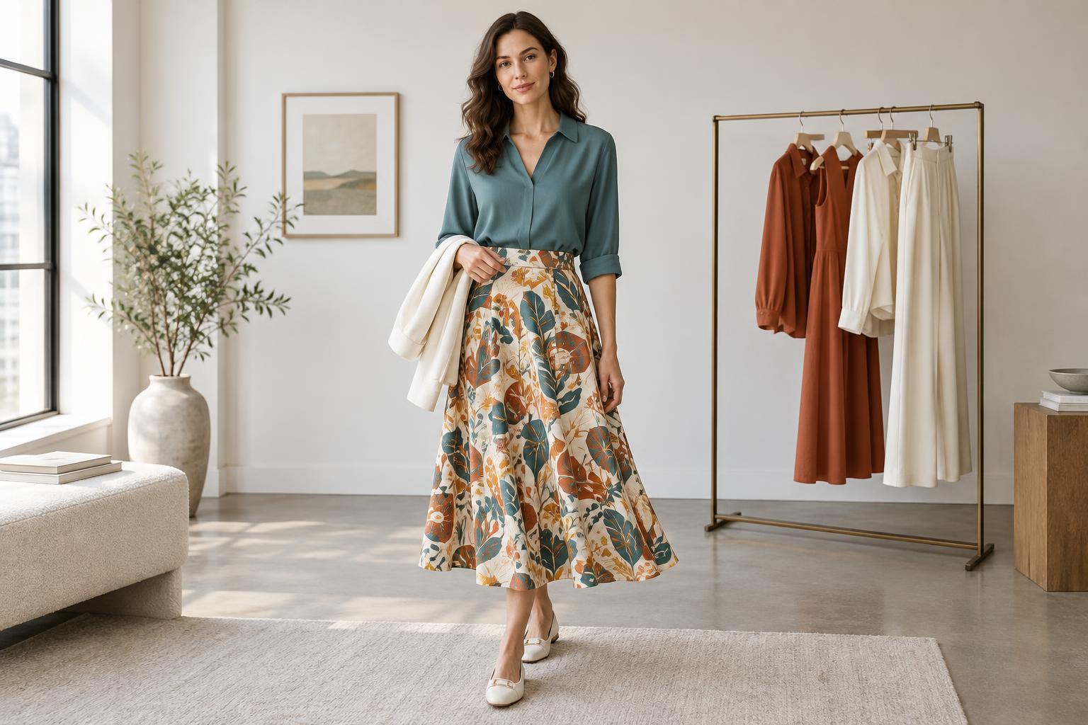
Print scale describes the size of a pattern’s individual motifs: tiny dots, medium checks or oversized flowers, for example. It affects how noticeable a piece feels before you even consider its colors. A small print may read almost like texture from across a room, while a large motif is easier to recognize at a glance. Neither is inherently easier to wear. The useful question is whether you want the print to add subtle interest, anchor the outfit or share attention with another feature.
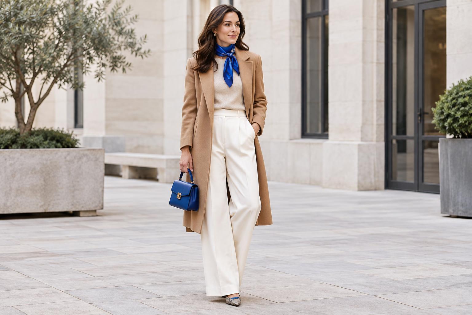
Look at the outfit as a whole rather than judging a patterned item on its hanger. A boldly printed scarf may occupy only a small area, while a fine print on a long dress covers much more space. If you want one clear focal point, try a patterned piece alongside quieter items. If you prefer a more layered look, let the print repeat a color found elsewhere in your outfit.
Compare scale with the space it occupies
The same print can feel different depending on the garment. Wide stripes across an entire coat make a stronger statement than wide stripes on a narrow belt. Large motifs also change when cut into smaller sections: a floral shirt with a cropped hem or a patch pocket may show only parts of each flower. When shopping or getting dressed, notice how much of the pattern is visible once the piece is worn, buttoned or layered.
Try the outfit from a few steps away, then look closer. At a distance, ask whether the print stands out as you intended. Up close, check whether important details get lost at seams, folds or under a jacket. This is a more useful test than a rule that assigns certain print sizes to certain body types. Your preferred silhouette, the garment’s cut and the effect you enjoy matter more than a prescribed match.
Use contrast to fine-tune the effect
Scale is only one part of a print’s impact. A tiny black-and-white check can look busier than a large, softly colored floral because its edges are sharply defined. If a pattern feels louder than you expected, compare its colors as well as its motif size. A print with colors close in depth often appears calmer; strong light-dark contrast tends to make its shapes more prominent.
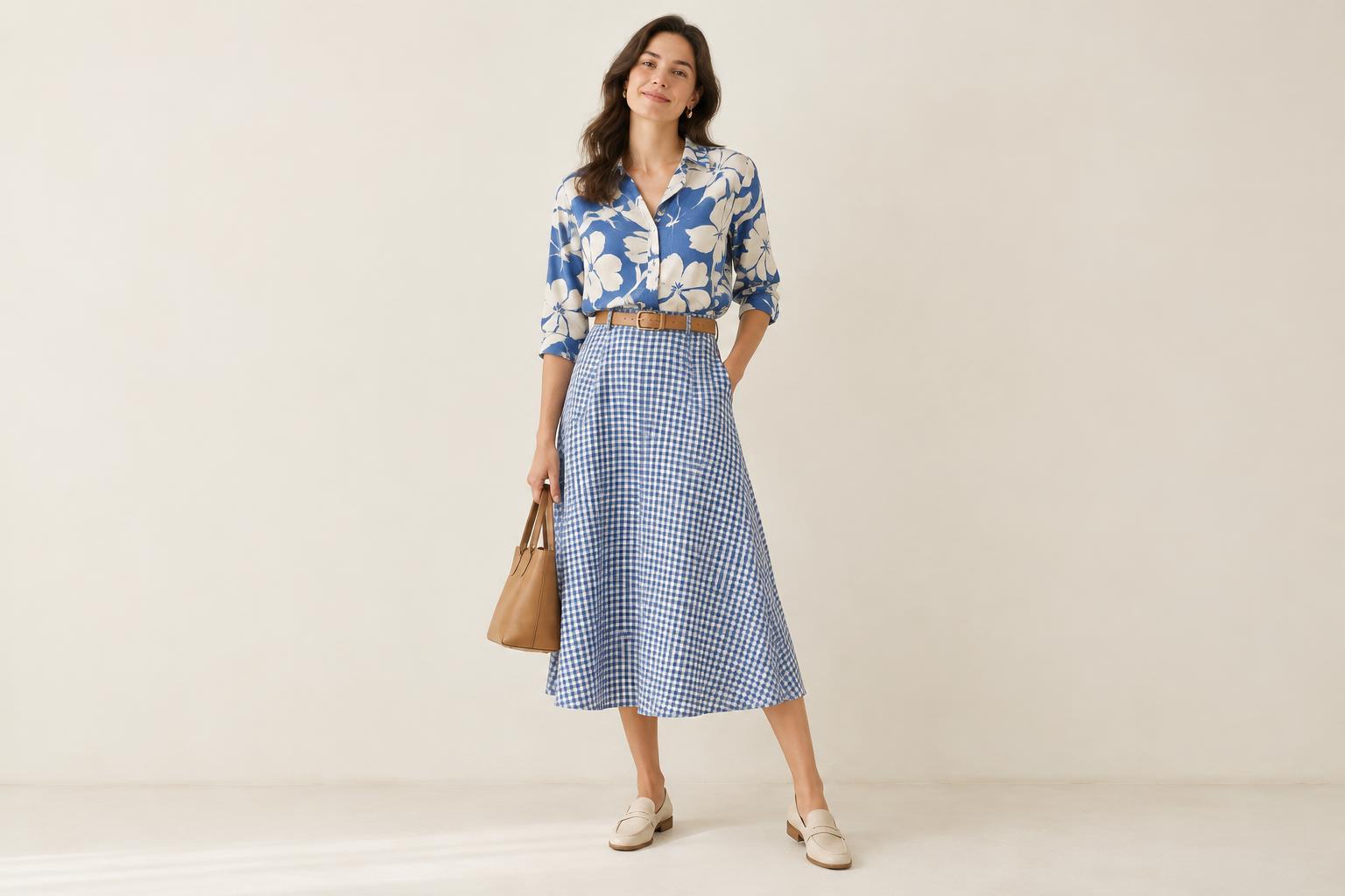
You can adjust that effect without replacing the printed item. Wear a patterned top under an open solid shirt to show a smaller portion of it, or pair a statement skirt with a top that echoes one of its quieter colors. Repeating a color helps the pieces relate, but they need not match exactly. If the print still feels too subdued, add an accessory in one of its brighter shades.
Mix prints by giving each one a role
Two prints can work together when they do not compete for the same job. One straightforward approach is to pair different scales: a broad striped shirt with a small checked accessory, or a large floral skirt with a fine dotted top. The change in scale gives your eye a place to start. A shared color can make the combination feel more connected, even when the motifs themselves differ.
For a calmer mix, leave some visual space between the prints. Solid trousers between a patterned top and patterned shoes, for instance, give each pattern room to register. For a busier look, place the prints together and keep other choices simple. There is no need to limit yourself to one formula: try swapping just one piece at a time to see whether scale, color or the amount of visible print makes the biggest difference.
Build confidence with pieces you already own
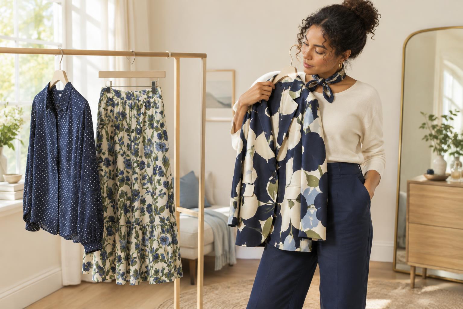
You do not need a new wardrobe to explore print scale. Pull out one patterned item you wear often and style it three ways: with a solid in a similar color, with a contrasting solid, and with another print. Notice which version suits the occasion and how you want to feel. A mirror photo can help you compare the overall effect, especially if the pattern looks different close up than it does from a distance.
Accessories are a low-commitment way to experiment. A printed scarf, bag or pair of socks lets you try a larger or higher-contrast motif without making it the foundation of your outfit. As you learn what you like, treat those preferences as tools, not restrictions. The best scale is the one that gives the print the role you want it to play.