Start with a small stretch of the color wheel
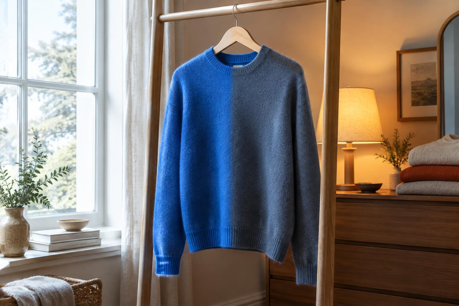
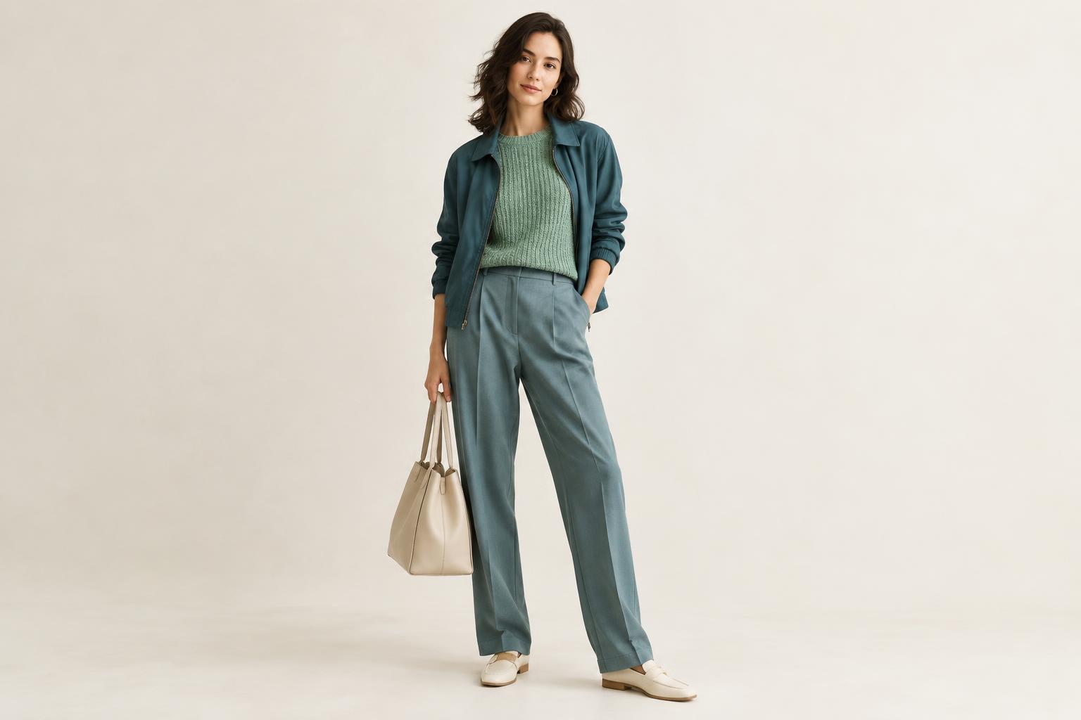
Neighboring colors sit next to each other on the color wheel. Blue, teal and green form one possible group; red, orange and yellow form another. Because the hues share some visual qualities, they can create a gentle progression across an outfit. You do not need to wear three distinct colors to use the idea. A blue shirt with teal trousers already has that connected feel.
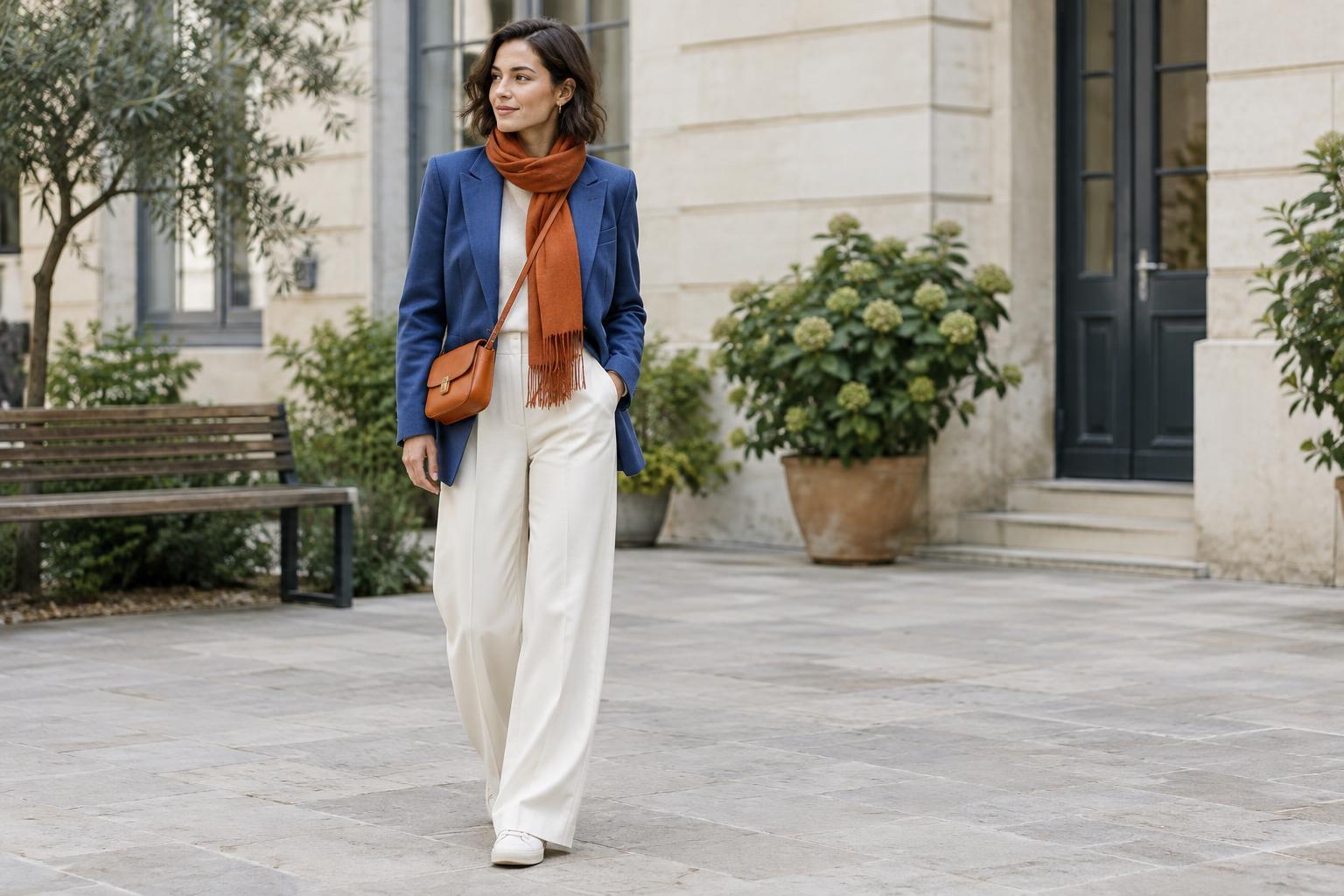
Begin with a color you enjoy wearing, then look to either side of it for a companion. If you own a green jacket, for example, try it with a blue-green top. If you are drawn to warmer colors, a rust sweater and a muted orange scarf can make an approachable pair. Use the wheel as a starting point rather than a strict test: the colors need to look good together in the light where you will wear them.
Give one color the leading role
A cohesive outfit does not require equal amounts of every shade. Let one color occupy the largest area, such as a dress, suit, coat or pair of trousers. Bring in a neighboring color through a smaller piece, such as a shirt, knit, bag or scarf. This gives the eye a clear place to settle while still making the palette feel considered.
For an everyday outfit, you might pair navy trousers with a teal sweater and add a small green detail in a bag or patterned sock. Alternatively, wear an olive dress with a yellow-green cardigan and keep the rest of the look simple. If the combination feels too busy, remove the smallest accent before changing the main pieces. Often, two neighboring hues are enough.
Vary depth and intensity
Neighboring colors can blend into one another when every piece has a similar depth and intensity. To give the outfit definition, combine a dark shade with a lighter one, or a muted shade with a clearer one. Deep blue denim and a soft teal shirt, for instance, remain related but are easy to distinguish. A pale peach top can likewise bring breathing room to a darker coral skirt.
You can also make a subtle outfit from shades that are close in depth. In that case, texture helps the pieces stand apart: think of a smooth shirt under a chunky knit, or matte cotton beside a softly lustrous scarf. Check the clothes together rather than judging each color separately. Fabric, finish and lighting can change how a shade appears, especially when two items are nearly alike.
Use neutrals to create space
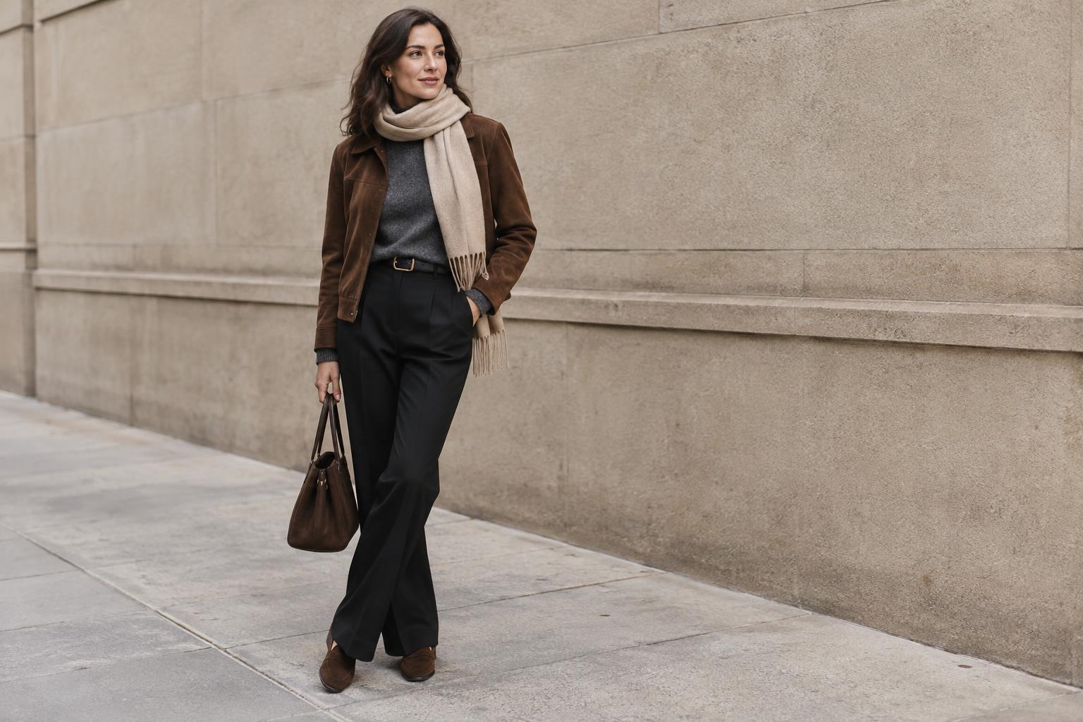
Neutrals are useful when you want the color relationship to show without covering yourself in color. White, cream, gray, brown, black and denim can separate neighboring hues or anchor them. A cream T-shirt beneath a blue-green overshirt and green jacket creates a pause between the layers. Brown shoes can give a warm orange-and-red outfit a quieter finish.
There is no single neutral that works for every palette. A crisp white may make bright colors feel fresh, while an off-white or taupe can sit more gently alongside dusty shades. If you are unsure where to begin, build an outfit from familiar neutral basics and change just one or two pieces to neighboring colors. This lets you try the combination without planning an entirely new wardrobe.
Finish with a quick outfit check
Before heading out, look at the whole outfit rather than asking whether each item matches perfectly. Notice where your eye goes first and whether the colors lead naturally from one piece to the next. If a bright accessory draws more attention than you want, swap it for a softer shade or repeat its color in a second, smaller detail. Repetition can make an accent feel intentional, but it is optional.
Patterns offer another easy route into neighboring colors. A striped shirt or printed scarf may already contain a small palette you can borrow from for a jacket or trousers. You do not have to match the printed shade exactly; a related version can work just as well. The goal is an outfit that feels comfortable and connected to you, whether your preferred result is quiet and tonal or lively and colorful.