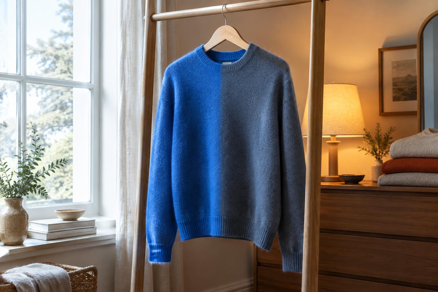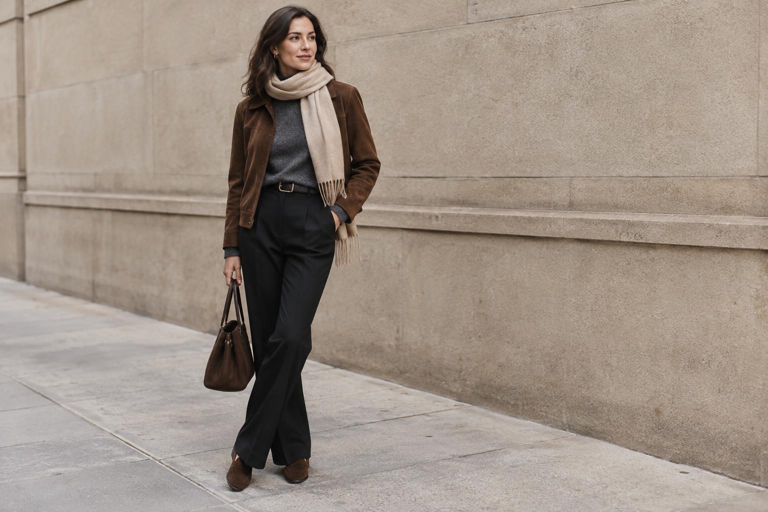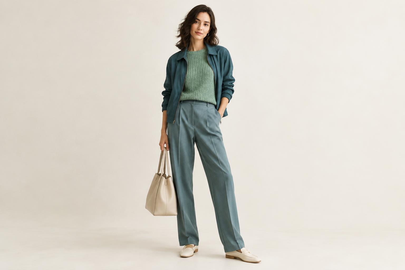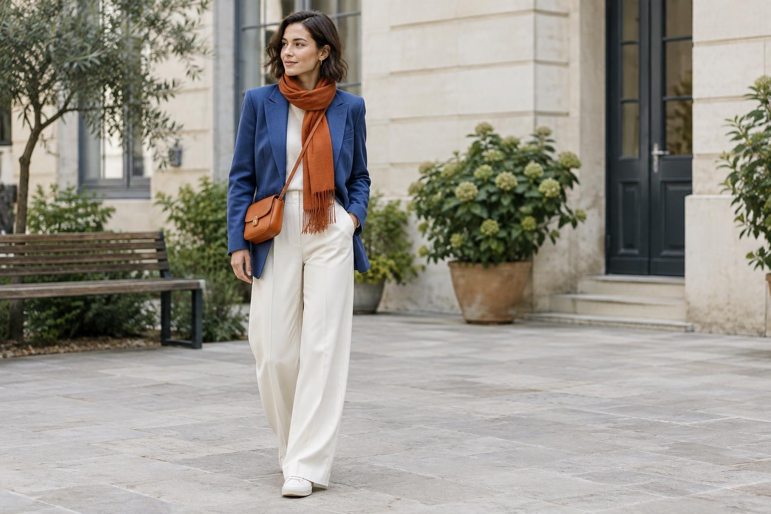
Start with the color relationship, not a rule
Complementary colors sit opposite each other on a traditional color wheel. Blue and orange, red and green, and yellow and purple are familiar examples. Their contrast can give a simple outfit energy, but wearing two vivid versions in equal amounts may feel louder than you intended. Think of the color wheel as a way to find possibilities, not a requirement to wear the brightest shade of each color.
The pair does not have to be literal. Navy and rust offer a quieter take on blue and orange; olive and burgundy soften the contrast between green and red. A pale lavender knit with a mustard accessory plays with the yellow-purple relationship. Begin with colors you already enjoy wearing, then look for a version of their opposite that fits your wardrobe.
Give one color the lead
An easy way to keep contrast balanced is to let one color cover more of the outfit. A navy dress with a small orange bag feels different from a navy jacket, orange trousers and matching orange shoes. Neither approach is wrong, but the first gives your eye a clear place to rest. Try a dominant color in a coat, dress or pair of trousers, then repeat its complement in one smaller item.
You can reverse the emphasis to suit what you own. If a rust sweater is the piece you want to wear, pair it with dark blue jeans and keep the rest simple. For a subtler start, let the second color appear only in earrings, socks, a scarf or a shirt collar. Step back from the mirror and notice whether the accent feels connected to the outfit or draws more attention than you want.
Adjust the shades before adding more pieces
Color intensity often matters as much as the color pairing itself. Two saturated shades tend to make a stronger statement than a deep shade paired with a dusty or pale one. Cobalt trousers and a bright orange top will look bold; denim-blue trousers and a faded terracotta top will usually feel more relaxed. If a combination seems too sharp, change the shade of one piece before changing the entire outfit.
Lightness also affects the result. A dark green jacket over a soft pink-red top creates a gentler contrast than equally bright green and red garments. Fabric can shift the impression, too: matte cotton, worn denim and textured knitwear may make a pairing feel more casual, while glossy surfaces can make the same colors stand out. There is no single best version; choose the level of contrast that feels comfortable for the setting.
Use neutrals and prints as breathing room
Neutrals can separate contrasting colors so they do not appear to compete. White, cream, grey, brown, black and denim can all serve this purpose, depending on the outfit. For example, a cream shirt between a purple cardigan and mustard trousers creates a pause. A grey T-shirt, blue jeans and a small orange accessory offer another low-effort combination. You need not add several neutrals; one may be enough.
Prints offer a useful starting point when you are unsure which shades belong together. If a patterned scarf contains blue with a touch of orange, wear it with a mostly blue outfit and let the orange remain an accent. You could also pick up that accent in a small accessory, but repeating it is optional. Keeping the other garments relatively plain allows the print and the color contrast to do their work without adding visual clutter.
Build a combination you will actually wear
Try styling one item you already own rather than shopping for a perfect matched pair. Lay it beside a complementary color, then test a few shades and proportions. A purple skirt might work with a golden-yellow tee, a muted yellow scarf or simply a bag with yellow details. Take note of which option feels natural with your usual shoes and outerwear; an outfit is most useful when it works beyond the mirror.
If the result feels overwhelming, remove one colorful piece, make an accent smaller or swap a bright shade for a muted one. If it feels unfinished, repeat one color in a small detail such as a belt or hair accessory. Complementary colors are a tool for creating contrast, not a test of whether an outfit is correct. The most wearable pairing is the one that gives you the amount of energy you want while still feeling like your own style.