What light–dark contrast does
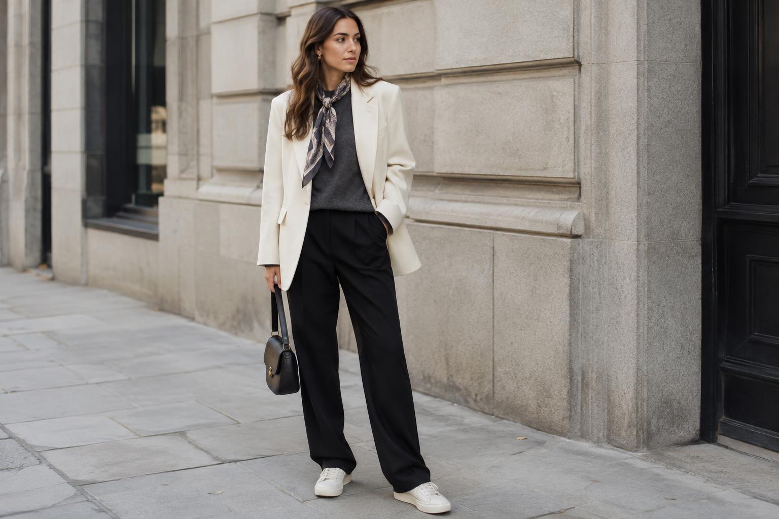
Contrast is the visible difference between pieces that reflect more light and pieces that reflect less. A white shirt with black trousers creates a strong contrast; a cream shirt with chocolate trousers creates a softer one. Neither is automatically more stylish. The difference is in how clearly each part of the outfit stands apart.
Light colors often catch the eye first, especially when surrounded by darker ones. That makes contrast useful for directing attention: a pale scarf can bring focus toward your face, while light shoes can draw attention to the bottom of an outfit. Darker pieces can give a look a quieter base. These effects also depend on fit, fabric texture, and where the colors sit, so treat them as options rather than rules.
Choose a simple starting point
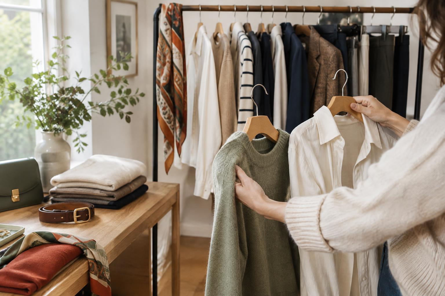
Begin with two pieces you already wear: a light top and dark bottom, or the reverse. An ivory T-shirt and navy jeans are an easy daytime pairing. A charcoal top with ecru trousers changes the emphasis without requiring a new color palette. Before adding anything else, check whether you like the balance of the large color areas.
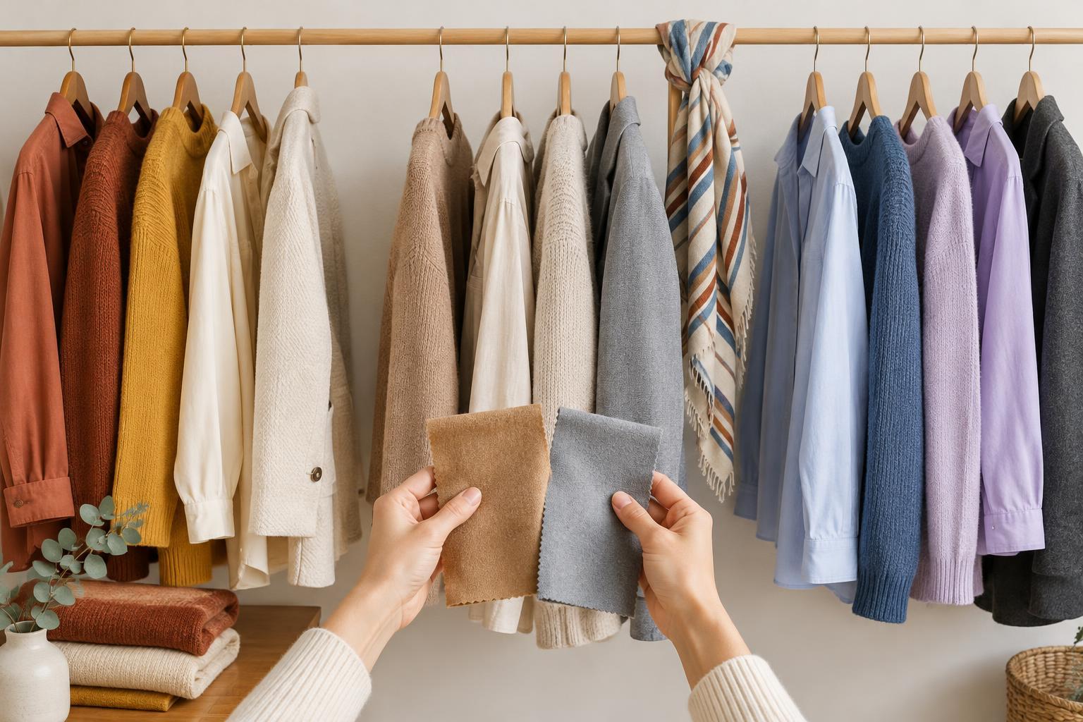
For a gentler effect, choose colors with less distance between them, such as stone and deep olive or pale blue and medium denim. You can also stay within one color family: a light gray knit over dark gray trousers still creates definition. If you prefer a sharper look, pair a very light piece with a very dark one and keep the shapes uncomplicated. The goal is to find a level of contrast that feels comfortable to wear, not to reach the strongest possible difference.
Use proportion to change the mood
The amount of each color matters as much as the colors themselves. A long dark coat over a light outfit feels different from a light jacket over dark separates, even if both use the same shades. When one color occupies most of the outfit, the smaller area becomes a point of interest. A white collar peeking out of a dark sweater, for instance, adds contrast without dividing the whole outfit in half.
Try taking a familiar combination and changing only the proportions. Tuck a light shirt into dark wide-leg trousers, then wear it untucked and notice how the visible areas shift. Add a jacket to narrow the strip of light fabric at the center, or roll a sleeve to reveal a little more of it. These small adjustments are useful when an outfit feels too stark or too flat; they let you edit what you own rather than start over.
Connect the pieces with layers and details
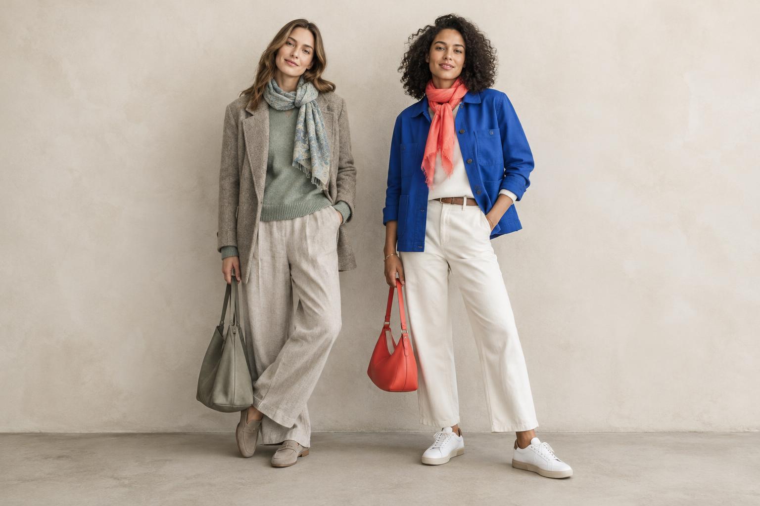
Strong contrast can feel intentional when a color appears in more than one place. With a black top and off-white trousers, a light hair accessory or bag can echo the trousers. Alternatively, dark shoes can repeat the top. You do not need perfect color matches; a small visual connection is often enough to make separate pieces feel like one outfit.
Layers offer another way to soften the jump between light and dark. A medium-gray cardigan can sit between a white shirt and black trousers, while a tan jacket can ease the transition from cream to deep brown. Texture helps too: ribbed cotton, worn denim, suede-like finishes, and chunky knits can add interest within a limited palette. Choose details you would enjoy wearing even if no one else noticed the coordination.
Make room for prints and personal preference
A print can do the connecting work for you. A striped shirt containing both light and dark tones pairs naturally with either a lighter or darker solid piece. If a patterned skirt feels busy, pick one of its shades for your top and let the print provide the contrast. You can also limit a bold pattern to a scarf, socks, or bag when you want a smaller change.
There is no need to organize every outfit around maximum contrast. Some days a crisp division feels right; on others, a low-contrast combination feels more relaxed. Check the outfit in the lighting where you will wear it, since shades and fabric surfaces can look different indoors and outside. Then ask a practical question: where does your eye go first, and is that where you want it to go? That answer is a better guide than a fixed color formula.