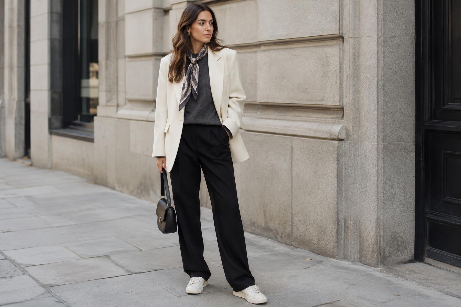
Start with intensity, not a list of approved colors
Muted and vivid describe how intense a color looks, not whether it is light or dark. A dusty lavender and a saturated violet can be similar in lightness but feel very different. Muted colors often look softened by gray, brown or an earthy undertone. Vivid colors look clearer and more concentrated. Neither group is inherently more stylish, versatile or flattering; the useful question is what effect you want an outfit to have.
Muted colors can create a calm, blended impression. Think sage trousers with an oatmeal knit, or a faded blue shirt under a charcoal jacket. Vivid colors are useful when you want an item to stand out: a cobalt bag with a simple denim outfit, for example, or a bright green shirt beneath a dark coat. The effect depends on what surrounds the color. A vivid piece among other vivid pieces may feel less prominent than the same piece against quiet neutrals.
Decide where you want the eye to go
Color intensity can guide attention. For a restrained outfit with one clear point of interest, keep most pieces muted and add a vivid element near the area you want to emphasize. A red scarf draws attention toward the face; bright shoes shift it toward the lower half. This is a styling choice, not a rule about which features should be highlighted.
Proportion changes the result. A vivid pair of earrings adds a small spark, while a vivid coat sets the tone for the whole look. If a large bright piece feels unfamiliar, repeat a related color in a smaller detail, such as a print or hair accessory. The repetition can make the choice feel deliberate without requiring an exact match.
You can reverse the approach when you want color throughout an outfit without a single loud focal point. Several muted shades, such as clay, olive and washed navy, offer variety while keeping the overall effect soft. To stop a low-intensity outfit from looking flat, vary the lightness of the pieces or mix textures: a crisp cotton shirt, a soft knit and smooth leather can each contribute something different.
Make color combinations easier to wear
A neutral base gives both muted and vivid colors room to work. With black trousers and an off-white top, try a vivid cardigan for a strong contrast or a muted moss cardigan for a gentler transition. Neutrals are not limited to black and white: denim, cream, gray, tan and chocolate can all serve as backgrounds. Choose the base that makes your added color look the way you intended.
Patterns offer another route. A print with one vivid color and several quieter shades can suggest an outfit palette: wear a muted piece that echoes the print, then let the vivid color remain in the pattern. If you want to combine a bright solid with a patterned item, repeating even a small amount of that bright color in the print can help connect them. Pattern scale matters too. Tiny checks may read as texture from a distance, while broad stripes make a more noticeable statement.
Fabric affects intensity as well. A shiny surface can make a color appear more prominent, while a matte or textured surface may soften its appearance. A vivid satin skirt and a vivid cotton sweatshirt will not create the same impression, even if their colors are close. Consider the garment’s shape and material alongside its shade rather than judging a swatch in isolation.
Test the effect in your own wardrobe
Before buying something to fill a perceived color gap, try a few combinations with clothes you already own. Lay out a familiar outfit and change one element: swap a muted accessory for a vivid one, or put a soft-colored layer over a bright top. Notice whether the new color supports the look you wanted, competes with another feature or feels more attention-grabbing than you prefer.
Look at the outfit in more than one setting if you can. Indoor lighting and daylight can change how colors appear, and a shade that looks bold on a hanger may feel easier to wear once the outfit is complete. A quick mirror check from a few steps away can also reveal the overall balance better than examining each piece up close.
You do not need to choose a permanent side between muted and vivid. You might favor softened colors for everyday layers and keep brighter shades for accessories, or build a wardrobe of clear colors and use muted pieces when you want a quieter day. The best balance is one you enjoy wearing and can combine with what you already have.