What color temperature means in a wardrobe
Warm, cool and neutral describe how a color appears, not how heavy or suitable for winter a garment is. Warm colors tend to suggest yellow, orange or red; cool colors tend to suggest blue or violet. Neutral describes colors that read as less distinctly warm or cool, such as many grays and beiges. These are useful visual guides, but they are not fixed labels that work for every shade.
A color’s name alone rarely tells the whole story. One red sweater may look tomato-like and warm, while another looks berry-like and cool. Two green shirts can differ just as much: an olive green may lean yellow, while a pine green may lean blue. Even black, white and brown can have subtle temperature differences. Looking at the actual garment is more reliable than relying on its product description.
How to spot warm and cool shades
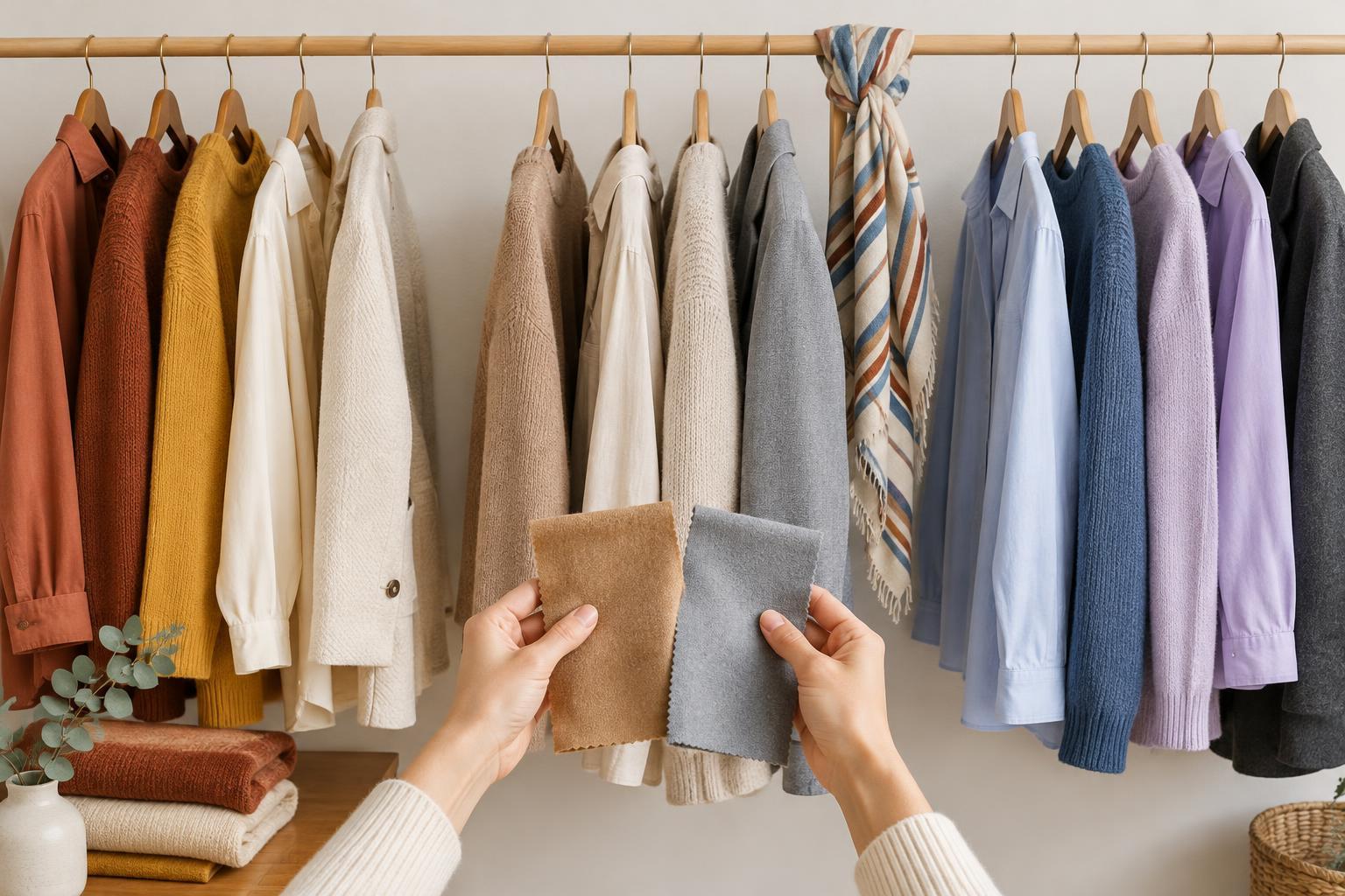
Start with familiar reference points. Rust, terracotta, mustard and camel often read warm because they have noticeable yellow, orange or earthy red qualities. Icy blue, cobalt, lavender and blue-based pink often read cool. Colors in the middle are less obvious. A vivid purple may lean warm if it looks reddish, or cool if it looks bluer. The same principle applies to pinks, greens and even shades of white.
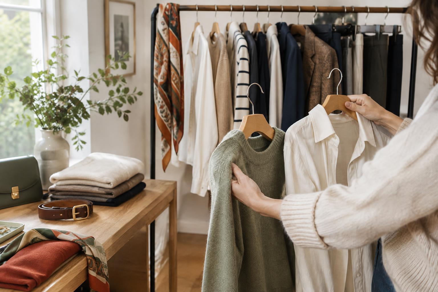
When you are unsure, compare two similar garments side by side in natural daylight. Place a cream shirt next to a crisp white one, or an olive scarf beside a blue-green one. Ask which looks more golden or yellow and which looks bluer or grayer. Comparison makes small differences easier to see than examining a single item in isolation. If possible, check the fabric away from strongly colored walls and avoid judging it under lighting that gives everything a yellow or blue cast.
Why neutrals can lean warm or cool
Neutrals are especially useful in a wardrobe because they pair with many colors, but they do not all behave alike. Cream, camel and many chocolate browns tend to feel warm. Bright white, charcoal and some blue-grays tend to feel cool. Beige, taupe, navy and black can vary: one taupe may look rosy, another gray; one navy may look almost purple, another slightly green. These differences can be subtle until you put pieces together.
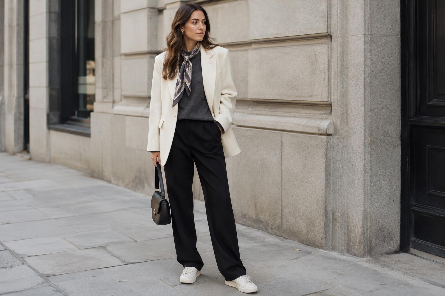
A neutral does not have to match the temperature of every other item in an outfit. Warm tan trousers can work with a cool blue shirt, particularly when the contrast looks deliberate. But if an outfit feels slightly disconnected, comparing its neutrals is a helpful place to start. A cream top and warm brown belt might create a softer link with tan trousers than a stark white top and cool gray belt would.
Use temperature to build outfits, not restrict them
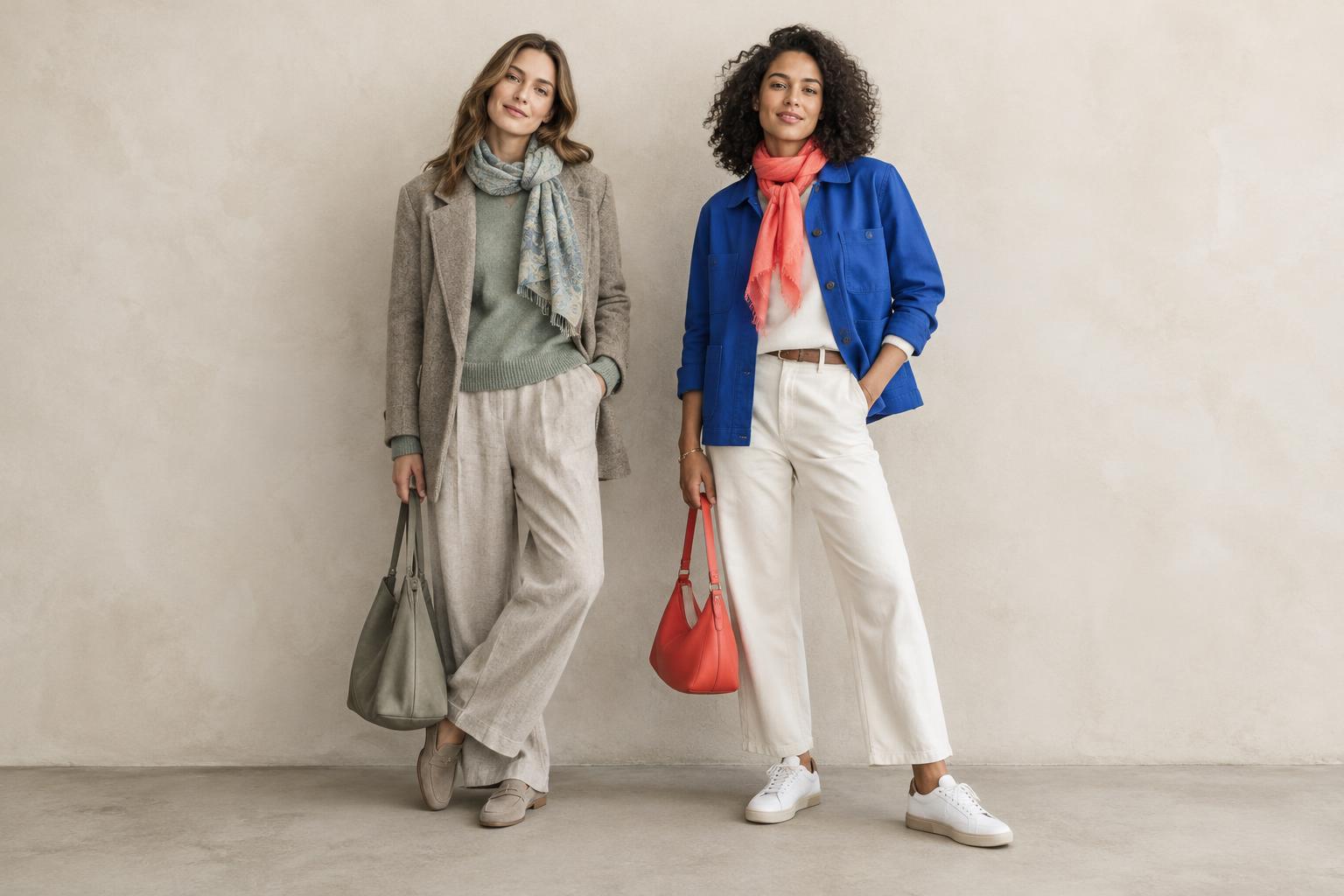
For an easy starting point, combine colors that share a general temperature. Try a rust knit with camel trousers and cream trainers for a warm combination. For a cooler look, pair a blue shirt with charcoal trousers and silver-toned accessories. Keeping most pieces in one temperature family can make an outfit feel connected even when the colors are not close matches.
Mixing temperatures can be just as effective. A cool denim jacket over a warm orange top gives each color room to stand out. If the contrast feels too sharp for your taste, add a bridge color: a patterned scarf containing both blue and orange, for example, can make the pairing feel intentional. Your preferred level of contrast matters more than any rule about which colors you are supposed to wear.
Check patterns, texture and personal preference
Patterns often contain several temperatures at once. Rather than classifying a whole print as warm or cool, notice its dominant color and any smaller accent colors. A floral skirt with a navy background and scattered coral flowers could work with either a navy top for a quieter outfit or a coral top that picks up the warm accent. This is a practical way to choose what to wear with a print you already own.
Fabric finish can also change your impression of a shade. A shiny surface may catch the color of nearby light, while a textured knit can appear softer than a smooth fabric in a similar color. If a combination looks good on you and fits the mood you want, there is no need to reject it because its pieces have different temperatures. Use warm, cool and neutral as comparison tools—not as limits on your style.