Start with the color wheel, not a set of rules
A color wheel arranges hues in a circle so you can see their relationships. Red, yellow and blue are familiar starting points; colors such as orange and green sit between them. For getting dressed, you do not need to memorize every position. It is enough to notice whether two colors are close together, across from each other or spread around the wheel.
The wheel is a planning tool, not a test of good taste. A rust shirt, for example, may read more like muted orange than bright red. A navy jacket can act almost like a neutral, even though blue is a color. Use the wheel to generate ideas, then judge the actual garments together. Their shade, fabric and size matter as much as their names.
Try neighboring colors for an easy blend
Colors next to one another on the wheel are called analogous colors. They tend to feel connected without being identical. Try a blue shirt with blue-green trousers, or a soft yellow top under an olive overshirt. You can keep the combination subtle by choosing muted versions, or make it livelier with brighter pieces.
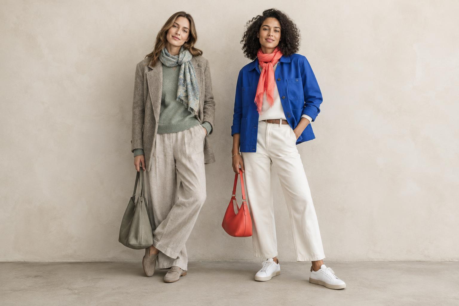
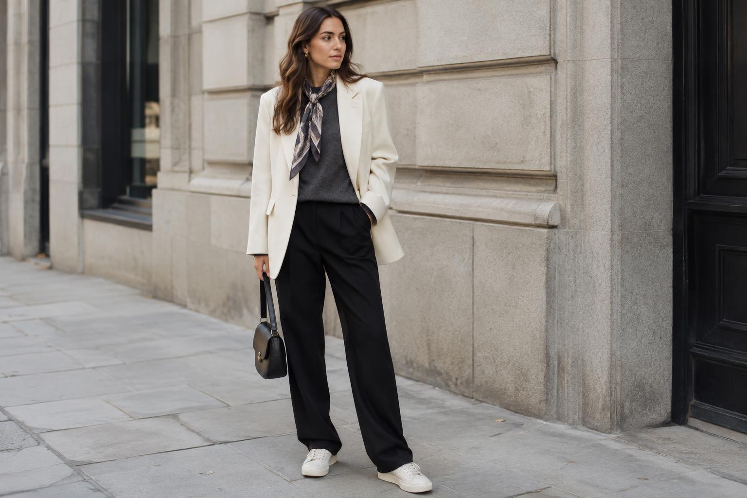
A simple way to build this outfit is to let one color lead. Wear the larger piece, such as a coat or dress, in your main color. Bring in a neighboring hue through a smaller item, such as a scarf or bag. If the result feels busy, add a neutral break: cream, gray, brown, black and denim can all give the eye a place to rest.
Use opposite colors as accents
Complementary colors sit across from each other on the wheel. Blue and orange are one example; red and green are another. Their contrast can be striking, especially when both are vivid and used in equal amounts. For a more relaxed everyday outfit, give one color most of the space and use its opposite sparingly.
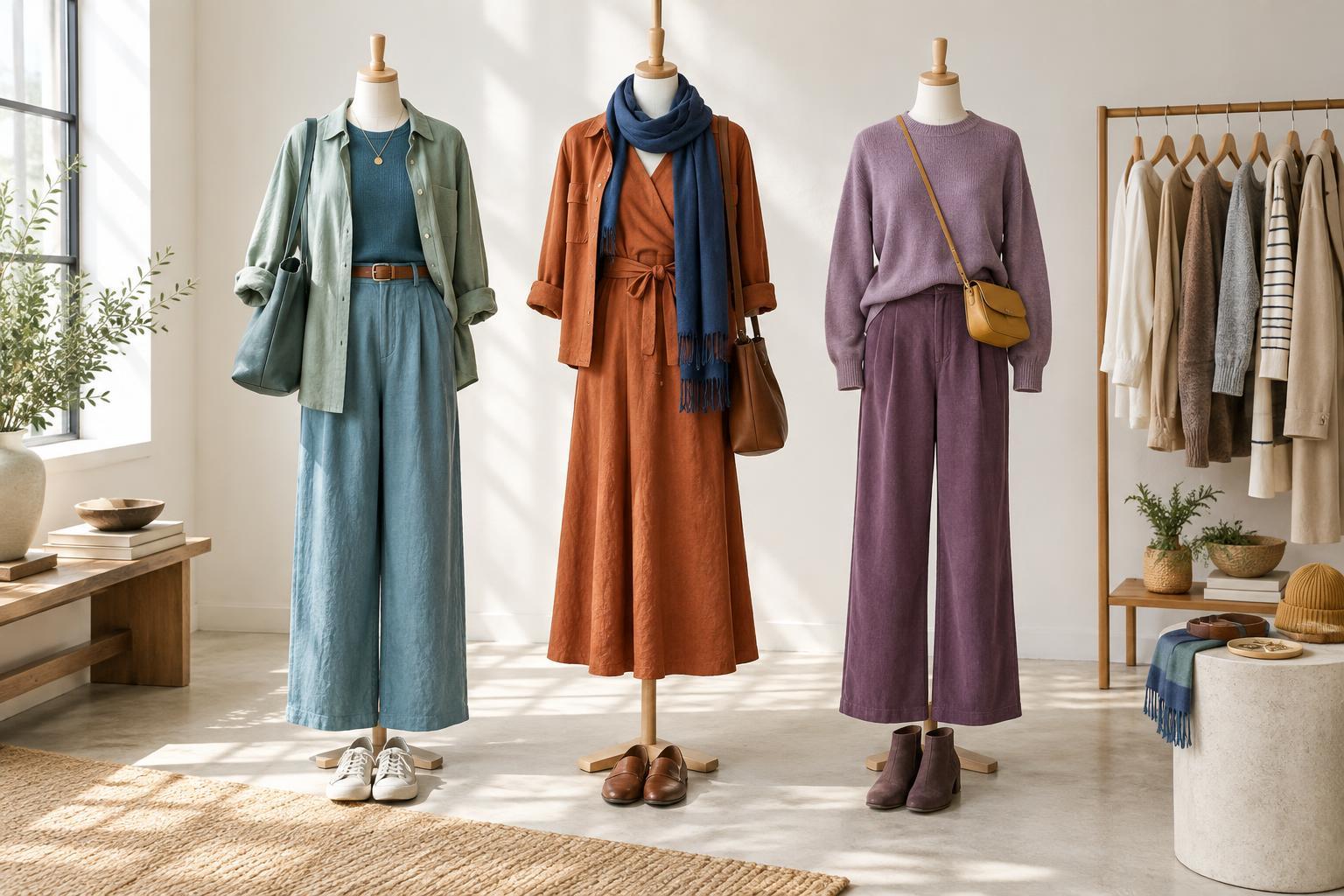
Think of a navy outfit with a rust knit, or olive trousers with a small burgundy accessory. These are softer interpretations of opposite-color pairings, not exact matches on a diagram. You can also adjust the strength of the contrast: a pale blue shirt and a muted terracotta bag will usually feel quieter than electric blue beside bright orange. Start with an accessory if a full two-color outfit feels like too much.
Experiment with three colors or one color family
For more variety, choose three hues spaced roughly around the wheel, such as blue, red and yellow. This is often called a triadic combination. The trick is not to give every hue equal weight. Blue jeans, a red sweater and a small yellow detail are easier to wear than three equally bold, large pieces. Muted shades can make the same idea feel gentler.
If you prefer a quieter look, try a monochromatic outfit instead. This means working within one color family while changing its lightness or depth: a pale blue shirt, mid-blue jeans and a navy layer, for instance. Texture helps separate similar colors. Crisp cotton, soft knitwear and worn denim can create definition even when their hues are close. The pieces do not need to match perfectly; slight differences often make the outfit more interesting.
Make the combination work in your wardrobe
Before buying anything new, lay out two or three pieces you already own. Choose one as the anchor, then test a neighboring color, an opposite-color accent or a tonal layer. Look at the outfit from a few steps away. If one item draws more attention than you want, swap it for a softer shade or reduce its share of the outfit. Shoes, belts and outerwear count toward the overall balance.
Pay attention to value, which is how light or dark a color appears, and saturation, which is how vivid or muted it looks. Two bright colors can compete even when they make sense on the wheel, while a light and a dark version may be easier to distinguish. Fabric finish can change the effect, too: shiny material tends to catch the eye more than matte material. Finally, check colors in the light where you expect to wear them. The best combination is one that suits your clothes, your setting and the amount of color you enjoy wearing.